It’s in the eye of the beholder, of course. But it would be great to see some solid recommendations.
The distribution doesn’t to too much, its mostly the desktop environment. I like the look of KDE Plasma the most. But usually I craft my own look after a while.
I like the look of KDE Plasma the most.
GNOME vs KDE gang fight has been summoned.
The look of GNOME isn’t the problem of GNOME. ;-) I’m not a good citizen right now.
Absolutely. GNOME often looks better, but it just doesnt work. Basic things everywhere are removed or not added.
One man’s “basic” things are another man’s clutter …
So you mean…
- editing images (in the viewer, screenshot tool)
- being allowed to customize the UI of any app
- changing the login screen (gdm) background
- creating a textfile from the filemanager
- editing .desktop entries graphically
- …
?
Hahaha, I disagree
Yea, none of those things matter to me.
Don’t get me wrong, I’ve had plenty of fun customizing DEs but I don’t really need that on my daily driver. I also have more of a terminal based workflow so perhaps shell customization scratches that itch for me.
To each their own :)
This is not about customizing. What app do you use for editing images, or dont you do this at all?
On GNOME either using Gwenview (KDE) or GIMP, Krita, Kolourpaint, Pinta would work. Which are all very big programs.
I have given in to GNOME. Set dark mode, install the extension “Tactile” and never touch the setting again.
Well GNOME has issues but in terms of look it’s 69420x better than KDE.
The thing I’ve learned in the many years of watching this fight is that the things Gnome people (of which I am one, though I have immense respect and appreciation for the KDE project) don’t like about KDE tend to be the things KDE people like about KDE and vice versa.
These projects are almost diametrically opposite. GNOME tries to provide a very simple, solid but not very configurable desktop with good accessibility and stability while KDE tries to make a very configurable and powerful environment that can be customized to anyone’s needs. I don’t like KDE because it’s unstable, way too powerful for my personal needs (their “simple by default; powerful when needed” concept doesn’t really work) and I just don’t like the UI. Though KDE’s better performance is an objective advantage.
I tend to agree. I mean, the gnome workflow is more appealing to me (though I have since moved to a WM), but my dislike of KDE comes down to (a) too many options everywhere and (b) it looks too “sharp”. If KDE had an “I’m done fiddling” mode that hid most of the options and I found a softer theme, I’d probably like it fine.
Absolutely nothing I just said should take away from others’ preference for KDE. I’m glad we can like what we like.
I have to agree. I’m hoping Cosmic will be somewhere in-between!
It seems to still be strongly gnome-adjacent, which fits with the softer, “calmer” aesthetic Pop has, but with functional tweaks that are more aligned with Win11/KDE (absolutely intended as a positive statement, as far as moving the ball forward on UX design). I worry that team KDE won’t like the “sane defaults” simplicity that it appears to have inherited from the gnome days, but that might just be the part of me that experiences terminal choice paralysis every time I fire up KDE. :)
Agreed. I think it’s not about distros we should have pay attention, but desktop environments.
And about “most appealing” DE I think it’s subjective. Surely KDE has the most flexible structure and may be exactly what you want, but Gnome is also appealing for some people (myself included).
Again, there is no right or wrong, just personal preferences
You don’t need much to make something look fancy or modern. Even XFCE can look modern.
edit: made it less offensive.
Good for you that you like your XFCE environment
I would like to see how your desktop is, if you don’t mind
However, again, it’s personal preference
Can’t. feddit.de can’t upload images and in browser i suddenly get a server error(?) with my lemmy.ml account.
Well uh, left bar with virtual desktop overview bottom, window buttons top, autoexpand
right bar with network and systemload bars top, sensor numbers bottom, fixed size
top bar Android style with left hand clock and date, whiskermenu (symbol view) as the empty space in the center (title only and whitespaces as title), right hand systray with mail and connman-gtk, pulseaudio plugin. Bars are on intelligently autohide, theme is Adapta.This is on my notebook with touchscreen.
Nice thing is, XFCE can pin bars to specific displays or main display. Meaning, if i plug my ultrawide in, the top bar stays on notebook while left and right bar switch to the ultrawide, a center bar with Wiskermrmu with list view for desktop usage appears.
☯️
I took it as a question of which distro looks nicest out of the box (like, which distro manager has made real effort to make something particularly nice looking).
Somebody needs to tell me what they’re doing to Plasma to make them like it so much because when I install it with Breeze it just looks like Windows 2000.
Windows 2000 looks nothing alike KDE Plasma with Breeze theme. But besides that point, you don’t have to like what others like. It’s just taste.
I don’t really care how it looks precisely, so long as its semi-professional and consistent in its style.
Like, I change the font to Fira Sans, because Noto Sans gives me depression, but the rest of my customizations are all just to carve out my ideal workflow.
Windows 2000 looked amazing.
I don’t think it’s the distros job to look visually appealing. That’s the job of the desktop environment. Seriously I wish distributions would just ship vanilla desktop environments. All of the themed variants always have some issues. Maybe I’m just old and stubborn but that’s my opinion.
Fuckin same. It took so long for me to realize a lot of issues I had wasn’t because gnome was shit, it was because every distro fucks with gnome until it’s unusable. I finally tried fedora and now gnome is my favorite DE and I love the workflow.
Yeah, distros should, at most, change the default accent color and some pannel icon, but no more than that.
Assuming that the default is good then yes. But some default DEs are ugly as sin, or just hard to use.
I can’t think of any desktop environments that are ugly or hard to use out of the box
Granted.
For a beginner, however, this is a difference that would take some explaining. As you said, some distros heavily theme the desktop environments (DE) before shipping, so in that sense the question is fair.
By extension, of course, I am with you, as with the right amount of work, any distro can run any DE and make it look any way.
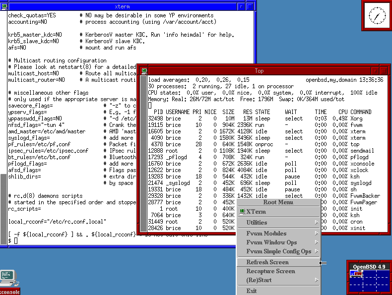
Definitely OpenBSD’s default fvwm

TempleOS received mostly “sympathetic” reviews.
😅
Does OpenBSD really default to FVWM in 2024? Metal.
Yes, and not even the modern fvwm3, due to licensing issues.
A blast of the past.
Garuda Hyprland edition. All the neon-RGB styling of Garuda gamer on top of Hyprland’s smooth UI.
Upvoted. I forgot about this distro. I don’t like its neon style at all but it’s something different and pleasing for some people.
It’s finally an opinionated distro I agree with. Of course you can get anything to look like anything but I just like how they picked a path and went so far down it to make their own unique out-of-the-box experience.
I don’t like some of the other decisions in Garuda, but it’s become hard to get away from it when even regular non-technical people who see it are like “Whoa, what is all that” and you literally just finished installing it and didn’t even change the wallpaper. It’s a very different feeling from what I’m used to with Linux and I’m into it.
I don’t know why other distros don’t offer out-of-the-box rices like this. It’s just fun.
You’re asking about the desktop environment and its default settings, which may or may not be the same on any given distro.
But I have a tie between Plasma and Cinnamon (mint’s DE). They both take only minor tweaking to get where I want them, and I can use them both out of the box with zero complaints.
Many distros customize the colour schemes and theming of their desktops. The out-of-the-box XFCE in EOS looks nothing at all like vanilla XFCE for example.
The new COSMIC desktop by System76 and Pop!_OS is very promising. I’ve been running the pre-alpha, and have been very impressed.
The current pop_os dark is already pretty damn good, it’s a very refined theme
deleted by creator
EndeavourOS has a pretty nice colour scheme and wallpaper going by default.
If I was forced to use a default distro look, it would be that or Linux Mint probably.
GNOME
Fedora Workstation. Gnome is pretty great on the eyes, and there’s a healthy Libadwaita apps ecosystem that is just *chefs kiss*
ElementaryOS also looks great for the system and core apps, although there’s not really a third party app ecosystem that fits with the Pantheon theme, unfortunately.
I second this but after getting Hyprland setup to my liking I don’t think I’ll ever go back to gnome or kde
Hyprland is definitively not noob friendly. Are you running it on Arch or Fedora? I’ve been wanting to try it, but with all the config file work needed, it scares me to have it break at some or other update.
I’m using regular Fedora 40 workstation with Gnome
If you enable the update testing repo you can just install “stable” hyprland using dnf.
I’d say the tricky part of config at the start is getting your monitors setup but you can use ‘hyprctl monitors’ to list the monitors and get the ids. The documentation/wiki is really good
Once you’ve got it installed you can logout of gnome and select hyprland from the cog on the login screen.
If you want the git release of hyprland you can use this Copr https://copr.fedorainfracloud.org/coprs/solopasha/hyprland/
Other stuff I use Rofi for launching apps Hyprpaper for wallpapers Waybar-git for the bar Kitty for terminal
Awesome. Fedora is my main driver (when i’m not distrohopping, lol). Thank you so much for sharing this. I’ll be taking it for a spin over the weekend.
Nice! have fun.
I’d definitely avoid downloading other people’s hyprland dot files. Most are over complicated.
Just keep it simple to fit your needs
I think GNOME looks very visually appealing with it’s consistency. The Libadwaita library has a nice aesthetic and looks very clean with nice spacing for elements to “breathe”.
I still prefer KDE since I can tailor the look to my needs and I prefer to have clutter over extra clicks. (I have top bar with “Opened programs”, Launcher, System tray, Time and a global menu and KWin script for managing Activities)
I feel like modern era of design has gone a bit overboard with the “clean” direction. It can be contrasted with Windows XP where you click “All programs” and you literally get all programs in the start menu with options of how to run or open them. I prefer to do “Menu” - > “Submenu” - > “Thing I want”.
Come to think of it I should probably make a launcher for KDE.
Pop!_OS
Gnome with a bit of a macOS twist. I really like it. I’m excited for Cosmic!
deepin or zorin
Linux Mint has a smooth, out-of-your-way look & feel to either MATE or Cinnamon that just makes me feel at home
Garuda Linux looks very nice
Honestly, whilst I would not recommend this at all, I find CutefishOS (you could argue it doesn’t even need to be a distro) incredibly visually appealing.
Perhaps I will get downvoted for being a sucker for modern visuals, but the theme is consistent, simple and easy on my eyes.
Although I like GNOME, the consistency bothers me and some of the design choices are inconsistent and don’t make for a great user experience, looking at Nautilus for example.


