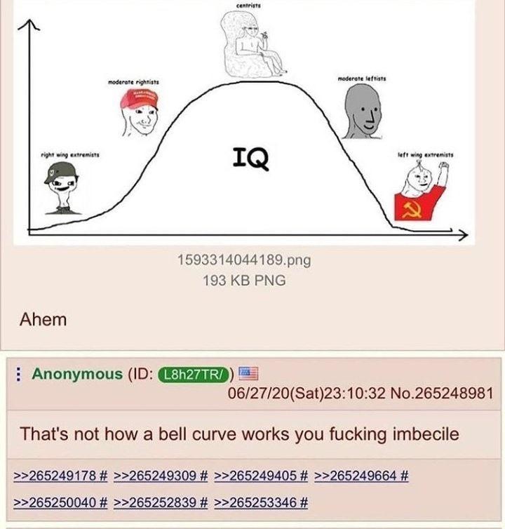
I mean there definitely could be a chart that looks like this. But I doubt it does in this case. I’m almost curious to see what it would look like but I don’t have that much respect for IQ as a measure of anything meaningful anyway. But my guess is there’s probably not much difference between IQ across the political spectrum. Perhaps slightly increasing as you move left due to more educated people leaning left, and I would expect there would be some association between IQ and education.
For an example of something that looks like a normal distribution but really isn’t:


I mean there definitely could be a chart that looks like this. But I doubt it does in this case. I’m almost curious to see what it would look like but I don’t have that much respect for IQ as a measure of anything meaningful anyway. But my guess is there’s probably not much difference between IQ across the political spectrum. Perhaps slightly increasing as you move left due to more educated people leaning left, and I would expect there would be some association between IQ and education.
For an example of something that looks like a normal distribution but really isn’t:
IQ is a racist bullshit measure invented to exclude black people from the military and education. It’s meaningless in all cases.
Yeah that’s kind of what I was referring to.
Both axis’s are not labelled so the graph could work, it is just bad design!