

I’ve heard many people saying that the front-end looks old and needs more work, but I’ve never heard someone describe how it could look better. To me, it looks perfectly fine. I wish it had a card layout similar to libreddit, but aside from that, I think it’s nice. If people want a completely different look, then there’s lemmyBB, and there will probably be other front-ends in the future. However, we should hear opinions about which styles people want.
You must log in or register to comment.
The mobile UI/UX needs some ❤️

especially the burger menu

Completely agree with you. Also we need more themes, cooler ones or more accessible too
I’ve tried several apps for Reddit on android over the past few years and this is what I’m currently finding uncomfortable using Jerboa for Lemmy:
- the numbers on the top right corner of the posts are confusing. Like right now they are saying “24 13”. Based on the upvote behavior I think 24 is rating. I’m guessing 13 shows how old is the post but it looks counterintuitive without a measurement unit. Is it 13 mins or 13 hours or 13 months or what?
- is there a way to collapse comment threads?
- on some of my previous apps for Reddit there was a way to hide read posts. I don’t really want to scroll past everything I’ve already seen every time I open the app.
That said, I really like Lemmy and hope it’ll get the fanbase it deserves.
is there a way to collapse comment threads
Tab and hold top of the comment.
Oooh thanks, didn’t realize it was possible
hold the top bar of a comment down to collapse it
Oh, thank you, today I learned something new :3
It would be very cool to partner with a designer and improve the UX in a professional manner
I think it should look a bit more like old.reddit + RES (though not a copy). Pretty much if the choice is between looking more like old.reddit + RES or looking like new Reddit, go with the old.
Some specific issues I am seeing:
Half my screen is dead space, and why is the sidebar right up against the main column of text?
Extraneous stuff should be right (or left, depending on layout) justified, putting space between the main content and the sidebar. Also, let the center column be wider if someone has a wider screen.
I would like to be able to expand text or images without going all the way into the post. Basically, push everything else down and show the post, but leave the user on the front page and don’t load the comments.
I would like to be able to expand text or images without going all the way into the post.
You can expand the text of a post by clicking on the book option. Posts with image urls can be expanded by clicking on the thumbnail. I’ll take a crack at the whitespace stuff when I get the chance.
You can expand the text of a post by clicking on the book option
Ah, I didn’t see that icon. Might I suggest that the icon replace the blank thumbnail space for text posts then? Smaller than the thumbnail space, larger than the current icon. And I may have been assuming the images acted like the text posts. Hmm. Or perhaps there is not enough visual distinction between image posts and website URLs. I see now that there is an icon in the upper-right corner of the image. Maybe I just need to retrain to figure that out.
I mentioned this in another piece of the thread, so I don’t know if you saw it, but a website I go to a lot (Royal Road) solved whitespace with a nice neutral-to-slightly dark landscape that everything goes over. So this way central column width could be expanded a bit without covering the whole screen.
Improving on that idea, perhaps you can even provide several options in the settings. Nothing high res, that’s not the point, but a pleasant space filler.
For me, the primary issue now is it’s not clear how federation works. The UI now seems to be heavily inspired by traditional media (e.g. reddit, Twitter). But there’s not a whole lot of clarity when it comes to federation-specific features.
- I’m not exactly sure which communities and users are from where? It’s not always obvious? Since moderation rules are different for different communities, this seems vital. Subtle uses of BG color or icons could go a long way.
- Speaking of moderation rules, where are they?
- How can I explore other communities on other instances? I know there is All. Is that before or after my instance’s filtering?
- Are there ways of automatically exploring/aggregating similar communities on different instances? I saw someone use #hashtags, they took me to a website I don’t recognize. Are hashtags even part of the protocol?
- Clicking on links to other communities in Jerboa takes me to the browser. Huh?
- Jerboa: tapping a comment in a list (e.g. profile, inbox) doesn’t take me to that comment. This seems vastly more important than preserving text selection in those contexts.
I am really missing a way to hide posts/threads I have already read and am not interested in further updates. I am scrolling past the same few popular posts until I reach the newer posts that are still gaining popularity. Only option is to sort by new, which might be difficult when more posts hit the service.
You should be able to uncheck “Show Read” here in your user settings:
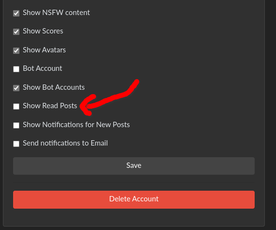
Then you’ll hide any post that I believe you comment on or upvote/downvote, I think? I’m not sure how it counts something as being “read,” that could use some work/clarification. There are times where I feel neutral about a post and don’t want to upvote or downvote (or I see something I dislike on Beehaw, which explicitly disallows downvotes).
For me, it hides every post I clicked on, even when I haven’t voted or commented
It should, clicking into a post is what it counts as reading it. Voting or commenting is a separate action.
Main thing that bothers me is when I tap an image to see it enlarged, it just opens it in a browser, which I don’t want…
There’s two things that I miss from my current reddit frontend:
- The density of posts. Lemmy feels sparse. Most of the UI is empty on my 16:9 monitor. I would like to have the equivalent to reddit’s classic layout, where the sidebar is all the way to the right, and content has no padding before/after it. Everything in blue is dead space.
- Comment nesting is kind of hard to follow. I suspect that this is because lemmy currently visually indents comments, but does not have indentation guides that extend below the current comment. Compare the following nesting visuals (the second is from old reddit, the first is from a text editor):
With a lemmy thread:
Notice how the red line does not extend all the way down to the bottom of the yellow line. I think that’s much more difficult to follow than if it did. If, say, the toplevel comment were above the visible screen, we would not know how nested the comment we are reading is on first glance. A reader would be reliant only on color (which is also bad for accessibility reasons) to understand how nested a comment is, instead of receiving a coarse estimate from the number of vertical lines preceding a comment.
I made a PR implementing your idea for comment threads. I’ll get to your other suggestion later.
You are right about the colors being difficult to distinguish by some people, I liked it because it was clean, but now I think it shouldn’t be the default option if there can be a clearer one.
I’m brand new here, but you’ve written and shown my exact thoughts. Seconded, for sure.
Thirded. My main comment was going to be “an interface more like Old Reddit please” but these two points (the “low density” and the unclear nesting of comments) are really the core of the problem I’m having with it.
I’ll probably encounter more as I experiment more with actually doing stuff, but visually speaking those are front and center for me.
It’s almost impossible to navigate to other instances via the android app unless they’re saved in your subscriptions.
Yeah, that’s not a lemmy ui issue, though. Links to lemmy communities or posts open in a browser window from jerboa. Is there a standard way that apps should use to determine if a link is to a lemmy object (on any instance) or just a web page? Maybe a
HEADrequest and checking headers?My problem is in android 12, they no longer let you manually define urls for apps to open. Am app has to give you “verified links” now. This is like really really shitty because in the jeroba app, everytime someone posts a link to another place on lemmy, it’s won’t open that shit. . I’m probably going to buy an older phone because this is really fucking me.
Remember when newer tech used to actually be better than old tech? Pepperidge farm remembers.
One thing I’ve noticed (on mobile) is that it’s cumbersome to press the little “-“ to minimize posts. It’s rather small and minimizing is fundamental imo. Imagine if you’re reading a rather long post, you gotta scroll back up just to minimize.
Yes, my #1 request right now is to let me single tap a comment to minimize the entire tree
I don’t like how it feels like a copy of new Reddit. I would prefer a layout similar to old.reddit. This seems geared towards mobile with everything justified in the center so a tone of blank space on either side on desktop
Make sure yall open issues (specific ones please, not a ton in one issue), on the lemmy-ui github. Otherwise they’ll likely get lost, and people won’t be able to work on them easily.
The only thing I would like is a more compact UI, it feels lime a lot of the screen is taken up by big text and whitespace.
Probably what rehashing what people have already been saying but the things I would like to see changed are:
-
Wider. Please please make it wider. It doesn’t have to be a copy of old reddit but I find it distressing just how little space is used - 730px is just too damn narrow. It would be better (but not perfect in my eyes) if the sidebar was collapsible - I don’t need to see it all the time.
-
Opening text and images inline is different - you click on the image to open it inline but the text placholder thing takes to to the post directly? I know you can press the little “book” icon but that moves between every post. I don’t really understand this choice.
-
Related to the above - it sometime isn’t obvious when a thumbnail is going to take you to another website or just open it inline. The little “picture” or “external link” logo in the top right sometimes doesn’t show up at all well on dark images.
-
Can’t say I’m a fan of drawing an orange outline over every single UI item I click on.
-
The main view should be more compact - honestly I don’t really care for avatars but sure, I guess people do like them. If the view was wider the third line could easily be removed.
-
More indentation to the comments or an inset box -again less of an issue if the page was wider but I find the couple of pixels between indents not very visually distinct.
Don’t get me wrong, the site is very usable and I’m not saying it has to be a direct copy of old reddit but I currently think it is very cluttered - so many icons and things going on in such a narrow space.
-
I don’t think “old” is a bad thing. Mostly, it’s just kinda rough around the edges.
The menus could look more … “menuy”. Like when you open the main menu from the hamburger button on the top right, it’s just a flat list of links with no styling other than font and color. It could use a visual bounding box.
The user menu (when you click/tap your username) could use the same treatment and definitely needs some left padding so the text isn’t jammed along the edge.
The thumbnails should fill a fixed size box (though the size could/should scale with the user device’s display).
Some of the alignments get out of whack when interacting with interface elements. Like the subscribe/unsubscribe links in the community lists (also, those could look more like buttons instead of plain links).
I could have sworn there was a dark mode just earlier today when I turned off the “night mode” feature in my browser, but now it’s suddenly gone? In any case, would be nice to have, but my browser’s built in night mode works well enough.
There’s probably more, but I haven’t been there that long.
The menus could look more … “menuy”. Like when you open the main menu from the hamburger button on the top right, it’s just a flat list of links with no styling other than font and color. It could use a visual bounding box.
I’m intetested on what that would look like.
It occurred to me the hamburger button only shows on small displays. Nonetheless, I don’t think it needs to be anything too fancy. Just a little tweaking to signify “this is a control element”, similar to the sidebars. I just tweaked the CSS in dev tools and took a screenshot:
Also affects the element on wider screens

A couple of other things I noticed while writing this reply. It took me a bit to figure out that the [preview] button can be clicked again to return to “edit” mode. I think it the button should “edit” to indicate it’s function during preview mode.
I’m not a fan of how the search button immediately redirects to the advanced search. Personally, I’d prefer a text box with execute (the magnifying glass) and advanced buttons.
One last thing (for now lol) I noticed while reading comments is that some of the control icons are hidden without first clicking the menu button to expand the list. It seems like an unnecessary extra step when there’s ample space for all the icons anyway.