For what i heard, a lot of people on the Linux community use Krita for image manipulation, even though, it’s intended for digital painting, and GIMP is the one intended for image manipulation, because people don’t like the GIMP’s UI.
My issue is, i never understood why they don’t like the GIMP’s UI, since i never have issues with it,(Although it’s probably because i’m used to the UI) so i need to adress this problem and ask you What does the GIMP UI has that you don’t like or hate so much and why you like Krita’s UI over GIMP’s?
Before you event comment your answer i need to ask you to do the following:
-
Address each specific issue along with an concise and direct explanation of why you don’t like it
-
Answers such as “I just don’t like it”, “I don’t like where it’s placed” or anything alike doesn’t count as “Concise and Direct”, we are adults, not 4 year old children.
-
If you can provide a suggestion of how GIMP’s UI can be improved, it would help a lot, and maybe this issue can be solved.
-
If someone else commented something you were about to comment, upvote them, this way we can address the most common issues effectively.
-
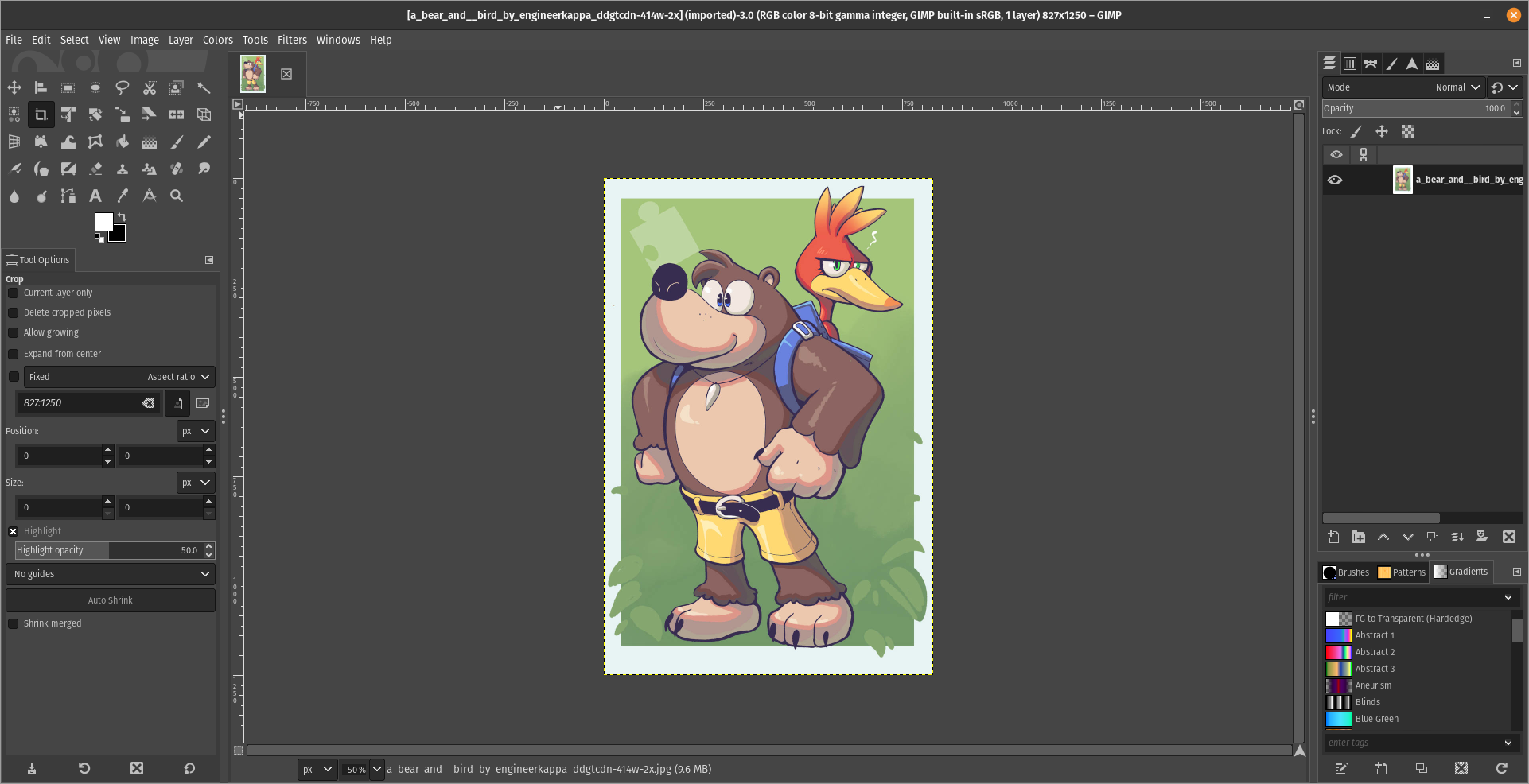
I need you to watch the screenshots of both UI’s, because something that most people don’t know, it’s how similar Krita and GIMP’s UIs are.
Krita’s UI

GIMP’s UI

(Credits to a friend of mine for lettig me use the screenshots.)
My ideas on how GIMP can improve it’s UI
-
Adding the option of the new UI selected by default, but with the possibility to switch to the new UI.
-
Possibly addding “work spaces” like Krita would help too, along with the possibility of exporting and importing them, this way people can have custom arrangements of the UI according to the kind of work they will do.
Thanks for reading and hopefully we can address this issue effectively.


Im not sure but im guessing most people complain because they want something intuitive and easy although my wife uses photoshop and I could not get her to use gimp so the layout must be different to some degree.
You can modify the UI to make it look like Photoshop, there are two ways for this:
Making GIMP look like Photoshop CC 2020 by Davis Media Design https://youtu.be/dY7g2JGyJeQ?si=AQ3uYQxHb7uG0xd3
Installing the PhotoGIMP addon for GIMP, also by Davis Media Design https://youtu.be/57DNUsf4A-0?si=XSCZhf_6rf4k25qx
I would personally recommend the first one, but it’s up to you.
thing is I don’t use photoshop. my wife does. its hard to explain her personality but im not using any convincing chips on this particular battle as we have more important things to get handled. Maybe someday.
Well, here’s one final advice from my part.
Go slow and gradual
Changes are not easy, you need to get hang of GIMP before makig the switch, try it, learn to use it, see if you like it.
Another alternative is Photopea, but it’s propietary and it’s a browser application, although it’s available in Flathub.