

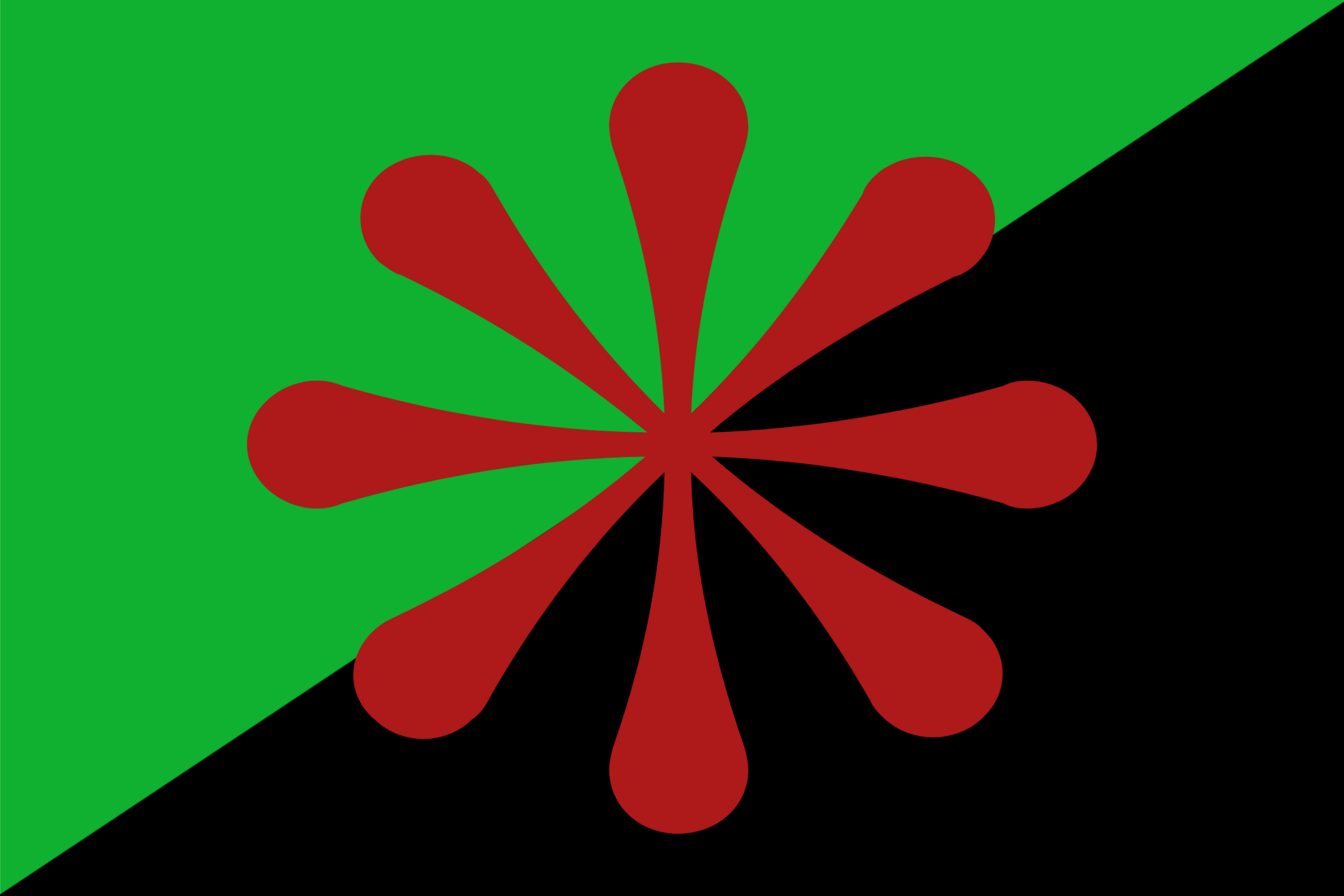
The green represents the need for an emphasis on ecological change, whilst the black is in reference to the black anarchist flag (here’s some historical context).
The red 8-sided asterisk represents the urgency for communities to cooperate in ridding the planet of eco-fascism. I picked the 8-sided one to represent the worldwide need for change.
Edit: anarcho-communism is not a type of fascism. Y’all do realise that this is a leftist Lemmy instance, right?
I like it, reminiscent of Moorcock’s 8 pointed chaos star, but less aggressive, more community / cooperation. If that’s the intent, blue might be a better fit than red, perhaps with a red circle (or red outer / blue inner circle) around for the fight against eco-fascism. That gets the three primary colors for infinite possibility as well.
How about now? Thanks for the suggestion, btw! I think it looks better.
I feel like the blue doesnt stand out well against the green, but besides that I really like it
Yeah, that’s good (I think it looks better too). I like the community pressing in on fascists, better than my thought, which was a circle around the asterisk. Also has a flower motif and a caring for waterways aspect.
Now it looks like a daisy. Much better.
Oh, tiny niggle, the slight overlap of the blue on the green / black dividing line is unsatisfying once you see it. Either make it exactly tangential or perhaps lean into it with a stronger curve for a ying-yang symbol, but that seems a little too much, less is more.
I say keep the red, as the red is a symbolism for communism which is inherently community oriented.
Hmm, it’s also the color for stop. What color would you use for fascism, it’s mostly black which conflicts with anarchism, or perhaps brown. I think the wide solarpunk umbrella is more important than the communism, but YMMV.
Well, Fascism’s color is definitely not black since, historically, the black flag has been a symbol of Anarchism. Fascism, as far as I’m aware, isn’t represented in flags through the use of color. It mostly uses other types of symbols.
I think for the flag that is trying to intersectionally represent all three (anarchism, communism, and solarpunk) should take into account their known symbolism and expand on it rather than to entirely replace it, make it more readily readible from a glance what the flag is representing.