

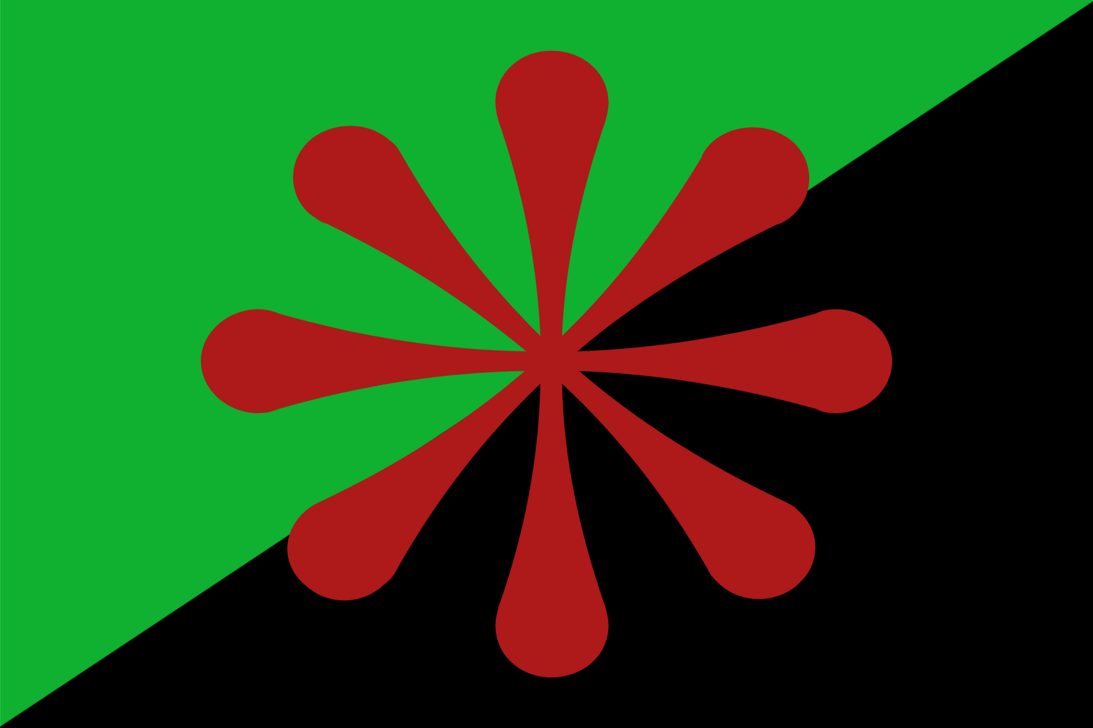
The green represents the need for an emphasis on ecological change, whilst the black is in reference to the black anarchist flag (here’s some historical context).
The red 8-sided asterisk represents the urgency for communities to cooperate in ridding the planet of eco-fascism. I picked the 8-sided one to represent the worldwide need for change.
Edit: anarcho-communism is not a type of fascism. Y’all do realise that this is a leftist Lemmy instance, right?
How about now? Thanks for the suggestion, btw! I think it looks better.
I feel like the blue doesnt stand out well against the green, but besides that I really like it
Yeah, that’s good (I think it looks better too). I like the community pressing in on fascists, better than my thought, which was a circle around the asterisk. Also has a flower motif and a caring for waterways aspect.
Now it looks like a daisy. Much better.
Oh, tiny niggle, the slight overlap of the blue on the green / black dividing line is unsatisfying once you see it. Either make it exactly tangential or perhaps lean into it with a stronger curve for a ying-yang symbol, but that seems a little too much, less is more.