Well for the purposes of understanding this, you don’t need to. This post is stupid for so many other reasons. Like any graph your axis have to make sense. You’re plotting two pieces of data against each other so you need to know what those two pieces of data are and what their scales are.
But here they’re measuring IQ against political leanings. But that doesn’t work because political affiliation isn’t a scale any more then favourite colour is a scale. IQ is a scale, but the bottom axis is just nothing.


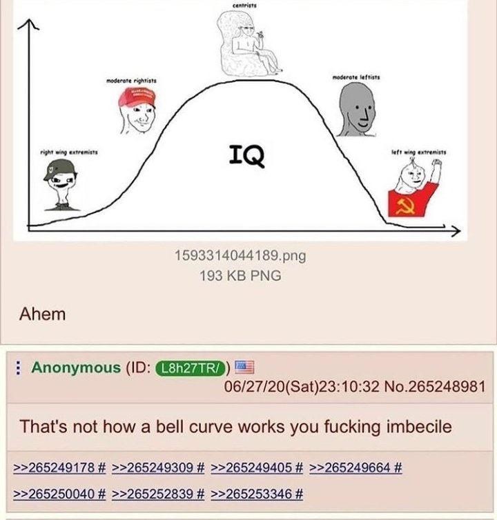
Well for the purposes of understanding this, you don’t need to. This post is stupid for so many other reasons. Like any graph your axis have to make sense. You’re plotting two pieces of data against each other so you need to know what those two pieces of data are and what their scales are.
But here they’re measuring IQ against political leanings. But that doesn’t work because political affiliation isn’t a scale any more then favourite colour is a scale. IQ is a scale, but the bottom axis is just nothing.