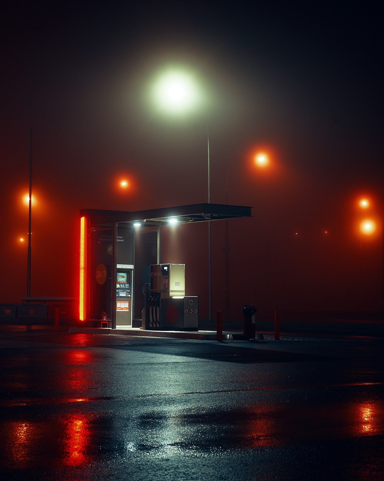
Ok, someone please explain to me why default wallpapers are a story in any way?? And everytime a new version of a desktop comes out, I’m baffled to see that theres an actual discussion and debate about…default wallpapers??? Like in the same sense that people talk about ACTUAL desktop features…
You guys don’t change your wallpaper??.. Who in the flying fuck cares about the goddamn default wallpaper?!?!?!?
I actually don’t change mine if the default is nice. Or I keep it for a while till I replace it. Still baffles me that people think they warrant much discussion unless Gnome decides to ship a wallpaper with literal gnomes fucking or something.
“Why do you have a wallpaper with gnomes having sex?”
“Meh, it’s the default, I can’t be bothered to change it.”I’d definitely keep it on a personal machine just to get people to ask tbh
The GNOME wallpapers often have inner meaning, the stripe one denotes world temperature over the years getting warmer
This one denotes Forest Fires
Jacub Steiner is pretty creative
That’s actually…pretty well done, I saw that wallpaper and my first thought was forest fires.
A clean wallpaper is the first onboarding experience for a user. Some distros have horrible wallpapers. other than that wallpaper doesn’t matter. personally I did a lot of late night computer work so wanted a redish background. I found this image, did a deep search but coyld not find original artist/photographer.

Can confirm, I never thought I cared about wallpaper or that it made much difference but it turns out it was a big part of why I like elementOS/pantheon so much and after switching gnome’s wallpaper to a similar one I realised I liked it more
Sounds dumb but it really has a subconscious effect on how much you like the DE as a whole
Totally. We are driven to look for beauty, form, symmetry in nature, and assymetry for interest. IMO a bad wallpaper could turnoff a potential new user if it has that janky feel. Zorin and Elementary seem very polished because they took the time to start with clean wallpaper and polish the UI. And I realize Ubuntu is a good distro but can you imagine recommending it to a C level exec and their first look is a faceted pather looking thing that seems like 90s tron vector graphics. Similarily Pop!_OS is great but some dude is going to see a minimal colour posterized robot scene and think is this on OS for kids? Don’t get me wrong I love posterized art, but not everyone does.
They are learning from MacOS.
Agreed. Came into the comments to find out why this was worthwhile of a post and I still don’t understand.
They will never attain the perfection of Bliss, anyways.
The Kali users.
For me, the default wallpaper throws me back to the period it was made and reminds me of what it was like to use that version. This GNOME one feels a little generic and I swear I’ve seen it before. Feels like the right style to use in a dynamic wallpaper where colours randomly shift.
The first thing I do whenever I install any new OS is change the wallpaper, I dgaf about the default one lol
@RandallFlagg
@paskalivichi
Same here, I haven’t used a default wallpaper for more than a few minutes since the xp days
Im using endevourOS for about 6 months, before i used manjaro for 12 months, all without changing the default wallpaper
I… don’t care. I’m going to switch to my own wallpaper at first opportunity, and whichever distro is probably going to replace the default anyway.
It’s so weird to me when stuff like this makes headlines.
It’s not great.
With the triangles, it looks a lot like Plasma’s recent wallpapers
More like Plasma’s old wallpapers…
The mountain wallpaper?
Lets all be honest and civilized here. Its complete shit
I disagree. I think its nice. Professional and colorful
Personally I like gnome a lot as desktop environment. But Gnomes default wallpapers, not so much. Good thing you can change em easily.
Indeed. I dislike any kind of wallpaper except for just a single color:
gsettings set org.gnome.desktop.background picture-uri none gsettings set org.gnome.desktop.background picture-uri-dark none gsettings set org.gnome.desktop.background primary-color '#201b30' gsettings set org.gnome.desktop.background color-shading-type 'solid'why not completely black?
Not universally great with any bright light for me.
Also. Black smeared on OLED (I use ASUS laptop) when moving windows - universal issue. And non-consistent black on LCD due to light bleed. So I haven’t prefer black black for a long time. But that’s me. Not sure about him though
had Ubuntu for about 3 months now had has kept the same default wallpaper, I think it looks dope af
OMG! A wallpaper!
What is this, Ubuntu?
I like it, though it feels like a slightly different spin on 43’s wallpapers

I like 43’s but not these new ones. The colors are weird, plus there’s that patch on the left that looks like someone has taken a cigarette lighter to it.

I use this on my laptop and have a Windows XP Plymouth theme
I’m sad to admit it’s better than the Gnome wallpaper. Someone puked in that wallpaper we have now.
I do not think how it is sad. Bliss of WinXP is by far one of the all time best wallpapers to exist, considering it is also a real life location.
Not the biggest fan, but I can just change it later.
The dark mode version looks a bit more balanced iirc
This is not good. The past few Gnome wallpapers were much nicer.
Nice as an art piece, but horrible as a background.
The colors are not that great. It’s like a beautiful city being covered in grey smoke.
According to a different commenter, the meaning behind this desktop is supposed to be about forest fires so you’ve hit the nail on the head
Very depressing.


