
- cross-posted to:
- programmerhumor@lemmy.ml
- programmerhumor@lemmy.ml
- cross-posted to:
- programmerhumor@lemmy.ml
- programmerhumor@lemmy.ml
You must log in or register to comment.
This is not funny, it’s PEAK.
Thanks, I’ve been unironically looking for something like this
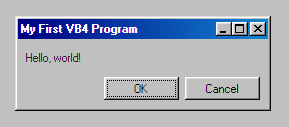
I unironically think this looks much nicer than Windows 11.
Me too, I miss this era
TreeView is designed as an afterthought. Some manager at MICROS~1 was like ‘ah yes we need an expanding nested list widget by tomorrow’ and they mutilated text edit box to draw text lines that expand when you click them. It does not have keyboad focus. It can only be operated with a mouse. It does not have shadow or raised widget borders. It has black text on white background, while every other widget has Windows Gray background.
The proper UI would be a separate button for each label, like multiple hierarchical combo boxes.
This is kinda cool, actually - why file it under humor?
Because it’s also funny
Abort. Retry. Fail.