

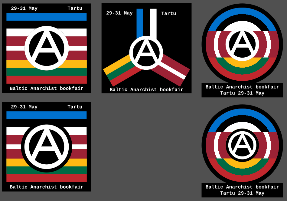
So I recently discovered there’s an anarchist bookfair happening in Tartu, Estonia. So I made these icons as a way to contribute spreading the news. What do you think?
More info about the bookfair is here: https://riga-anarchist-bookfair.hotglue.me/
So I recently discovered there’s an anarchist bookfair happening in Tartu, Estonia. So I made these icons as a way to contribute spreading the news. What do you think?
More info about the bookfair is here: https://riga-anarchist-bookfair.hotglue.me/
All good but the anarchist “A” should transcend the boundaries of the circle encompassing it for a more truly realistic graphic.
The one where the lines go past the circle is the one I call Punk Circled-A. The one I use is more restrained, making it appear more professional and approachable (in my opinion, obviously). But I did do one with the punk-A: . This one is drawn so it’s a lot more free-form.
/sidenote: When I say drawn I mean as opposed to designed like the ones in the main post. They are all made in inkscape, but for me drawing is imperfect, while designing tries to maintain as much precision as possible, eg proper ratios, straight lines and equal spaces. While drawing is embracing the imprecision of a human hand.
This one is also quite cool imo. Probably would go with paint-like, curved streaks for the outmost lines and lean into the “aggressiveness”, but I agree this is moving out from bookfair territory :)
I liked it before. I like it even better now. Good work!
I don’t really follow anarchy (this showed up on /all), but I really like this logo!
Good work.
That’s just the punk/graffiti way, the original is within the circle.
https://en.wikipedia.org/wiki/Circle-A
Regardless of which group modified the original it looks better to me when the lines break the circle. It feels more representative. Art is subjective though.