

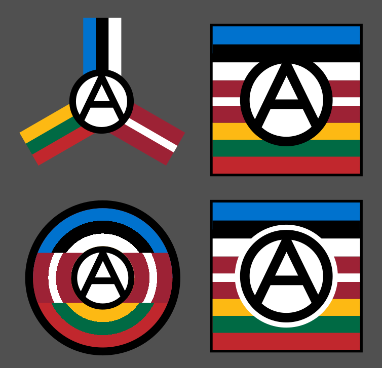
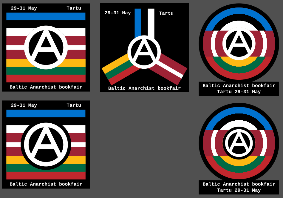
So I recently discovered there’s an anarchist bookfair happening in Tartu, Estonia. So I made these icons as a way to contribute spreading the news. What do you think?
More info about the bookfair is here: https://riga-anarchist-bookfair.hotglue.me/
You must log in or register to comment.
National flags and anarchism?
The flags are more meant to signify culture than nations/states. For me the flags have a cultural relation that’s far more powerful than the states. The flags were used by the people as a signifier of culture before the states took them and turned them into their own symbolica. Even in anarchism culture will persist and having symbols for these cultures is important.
Or to put it simply: “The state stole the flag from the people and now we will steal it back by using it to fight against it”.
national flags are exactly what they are. Keep them away from any anarchist symbol.
would you make another one with the American flag? You’re trying to sugarcoat a strange idea.
No I wouldn’t make one with the USA flag, because USA isn’t a culture. It’s a state. A State baked in colonialism and slavery. The USA flag didn’t exist before the state needed one. The design of the flag itself is based on the political reality. If I were to design anarchist iconography for north america I would use the first peoples’ flags as a template, or mangle the stars and stripes so much that it becomes unrecognisable.
The baltic flags aren’t like that. (Or at least the estonian one can’t really speak for the other two.) They are also symbols for the people. Used to identify a culture even when the state didn’t exist. A flag that’s designed by a bunch of university students that then became used by a country that was just finding it’s identity emerging from an oppressive overlord. At it’s heart these flags were used as symbols of resistance and identity to fight against a foreign regime. Why not take it one step further and use these symbols to fight against the idea of statehood itself? As a message that we decide what our symbols are and if we want to we can take yours.
The biggest difference is that these flags don’t just represent a colony. They represent a unique set of people that have their own language. The fundamental element of culture and until we create visual indicators for these languages that are separate from the states the flags are the best we have.
And as you ended you’re comment with a tangential question here’s mine: What do I use instead? What visual shorthand can I use to denote that this concerns the baltic region? That there are people who speak Estonian, Latvian, Lithuanian here?
Thanks for taking your time to explain, you convinced me :). Sorry for sparkling this debate, I should’ve considered that there’s a lot of hate for Baltic people in anglo leftist circles. I’d personally try to put some other cultural symbols maybe? But I’m Polish and in Poland the flag is mostly associated with nationalism (though not as obviously as the union jack or US flag). We’ve even opressed you guys under that flag :x.
Your designs are really neat, I like the circular one most.
read a little about nationalism and how it redefined the world.
https://en.wikipedia.org/wiki/Flag_of_Estonia according to that page, apparently this flag was born as a response to a similar question 200 years ago.
Why, for an anarchist, is it important to emphasize a national identity?
To me it’s not emphasising national identity. It’s signifying a culture. A culture that has been heavily oppressed and is currently starting to slowly languish as the bigger and more predominant culture slowly smothers it. I’ve seen this happen in my own mind as my internal monologue switched languages after watching a lot of english TV and Youtube.
It’s a shame that a language that is very different in it’s construction is starting to slowly be drowned out just because the internet has made english the language everyone speaks. I have no love for the state or the national identity the flag represents. That’s why I put a circled A on/next to it. To signify that I reject the state and the nationalism while accepting the culture behind that state.
The problem with nationalism, why it is nationalism, is the idea that only a certain group of people are deserving or valid in a culture. That speaking a different language or having different parents made you somehow different or superior or more deserving. It’s a method of othering. This is the core idea behind nationalism and it’s the one I (and every anarchist) reject. Everyone who wants to, is an estonian, no matter where they come from, it’s a culture, not a nationality¹. There is nothing inferior about being part of a different culture, but that different culture does exist and it needs to have a name and symbolica to survive.
¹: Do I need to say “for me” or “in my opinion”. I’ve gotten a lot of people treating me like an idiot because I leave it out from statements like these, but I just assume that’s implied. I’m saying it… and it’s blatantly false as a fact… of course it’s my opinion.
We have flags for every branch of anarchism for this reason. They all have slightly different ways of doing things. Slightly different cultures and customs. While I could try and come up with a flag design that works for this culture while not referencing the only other flag that the culture uses just because a state snatched it up first, using the already established visual shorthand for the culture is easier. And it’s also stealing one of the primary symbols the state uses to legitimise itself, the idea that it speaks for the entire culture. It does not. There are also anarchists who are part of this culture, and reject your nation.
And in the end. I don’t even care that much about this (yes this is how much effort I but into things I have minor care for). If everyone on this com said that this is a stupid idea I’d probably change my mind, but as it stands you’re the only one who has said anything about this. I wouldn’t use the flag in any other situation. I like the standard Circled A on black background for most things, but in situations where I need to reference the region of land between the Baltic sea and Peipsi I will use the blue-black-white flag with A Circled A on top and call it estonia, it’s the easiest solution.
i wasn’t the only critic of your idea
I’ve seen this happen in my own mind as my internal monologue switched languages after watching a lot of english TV and Youtube.
maybe you should read instead of “watching TV and Youtube”
The problem with nationalism, why it is nationalism, is the idea that only a certain group of people are deserving or valid in a culture.
Nationalism “further aims to build, and maintain, a single national identity, based on a combination of shared social characteristics such as culture, ethnicity, homeland, language, politics (or government), religion, traditions, or belief in a shared singular history, and to promote national unity or solidarity.”
France for example is a multicultural nation. One can “be French” without belonging to a certain culture. There are some shared values but nation, being an artifice, is redefined constantly. Still, you won’t be seeing anarchists with tricolor flags there. They may carry the black flag (or the red/black) but it would be absurd to draw circled A on a national flag.
Maybe you’re not an anarchist after all. Maybe being Estonian will overpower your libertarian flame in time.
maybe you will end up being a flag merchant 🤷
Fuck it. I’m done with you. You don’t seem to listen.
Actually, No. Here is the AFAQ chapter on nationalism: https://anarchistfaq.org/afaq/sectionD.html#secd6, and it is the perfect example of what I’m talking about.
This means that anarchists distinguish between nationality (that is, cultural affinity) and nationalism (confined to the state and government itself). This allows us to define what we support and oppose – nationalism, at root, is destructive and reactionary, whereas cultural difference and affinity is a source of community, social diversity and vitality.
My use of the flags is to showcase the nationalities that partake in this event, as they are in the geographic area. Not the nationalism of the state which has usurped these symbols.
And trust me I am an anarchist. First and foremost. Anarchism is the surrounding idea of the centre of my being, which is one word: “Kind”. I doubt there is anything that can overpower it. It’s fuelled by the kind of faith that others reserve only for god.
Hi! I’m here from all, so not very familiar with anarchist discourse. But as this affects me, being from the baltics, I have to ask: is fighting against (relatively) democratic states reasonable at this time? As long as russia, USA and china exist in their current form, there is no hope for a stateless society to exist without being crushed under the boots of a larger country.
The Palestine protesters in England who destroyed military production infrastructure are ideologically correct, but in the short term their work has a direct positive effect on ruzzia’s oppressive behaviour.
What’s your take on this? Love the imagery btw.
I have to ask: is fighting against (relatively) democratic states reasonable at this time? As long as russia, USA and china exist in their current form, there is no hope for a stateless society to exist without being crushed under the boots of a larger country.
Many anarchists would disagree with this. Anarchists strive to establish communities/stateless societies that are able to defend themselves against state repression. Many anarchists also believe state organized militaries to not be as effective in actually defending territory against invaders.
While not all examples are anarchist and successful, they all share libertarian ideals and are examples of libertarian communities defending territory against states / authoritarian forces. I think they should provide enough information to imagine an anarchist society defending itself:
Vexillology is information theory, not nationalism
Great job. They all look good.
The bottom 2 look best to me. I think the circular one is more interesting, but the square might be more easily understood.
Good luck with the bookfair :)
All good but the anarchist “A” should transcend the boundaries of the circle encompassing it for a more truly realistic graphic.
The one where the lines go past the circle is the one I call Punk Circled-A. The one I use is more restrained, making it appear more professional and approachable (in my opinion, obviously). But I did do one with the punk-A:
 . This one is drawn so it’s a lot more free-form.
/sidenote: When I say drawn I mean as opposed to designed like the ones in the main post. They are all made in inkscape, but for me drawing is imperfect, while designing tries to maintain as much precision as possible, eg proper ratios, straight lines and equal spaces. While drawing is embracing the imprecision of a human hand.
This one is also quite cool imo. Probably would go with paint-like, curved streaks for the outmost lines and lean into the “aggressiveness”, but I agree this is moving out from bookfair territory :)
I liked it before. I like it even better now. Good work!
I don’t really follow anarchy (this showed up on /all), but I really like this logo!
Good work.
That’s just the punk/graffiti way, the original is within the circle.
Regardless of which group modified the original it looks better to me when the lines break the circle. It feels more representative. Art is subjective though.
I like the circular ones!
Bottom right looks good
Especially for a cutout sticker, I think it would be cool to give away
I like the top right best.
And warm greetings to Tartu! Havn’t been there in a few years but it’s a beautiful town.
I really like the middle one
Nice job, also good to have multiple icons as examples because it helps the creativity :D
I think this I would like to know how it would look for the (Circle)A to be black, so maybe the first one but the (Circle)A lines are black and the infill is transparent?
Good shout! Making the A black really made the circular one pop. I think it even made the tri-angle work, although that may have just been from having removed the background.
I’m loving the bottom left. The black border around the circle-A gives it a sense of prominence that is lost on the version above it.
I find the right side is getting a bit too messy in terms of readability, and don’t read as flags. The middle is okay, but I think it would only look good on a transparent background and probably wouldn’t scale down very well.
I don’t think the middle one really works tbh, but the other two I like a lot, left for stickers and right for patches. Maybe I would make the A bigger on the square ones so that the circle goes into the blue and red lines a little bit. Good work!
Like one of the left ones, with the three flags stacked on top of each other, but round as a whole and the A full size over all of them.
Like this:

Hell yeah. Maybe switch black and white of the A? I don’t know.
It’s interesting for sure, but the A is very glaring. Making the border around the A bigger certainly improves it but then it starts covering up quite a lot of the flags. It also feels quite generic, I know the other ones are generic as well but this one just feels like “Take the flags and put an A over it.” done.
I see what you mean. In that case take the one on the lower right of your original set.
Can you make the circle that’s formed by the middle stripes on the right be the circle for the Circle-A, or would that not work?
I guess that the A ieeds to have another color, then, which would probably decrease readability.
Is this a redesign for an LGBT Captain America? 😅
The idea is nice, the realisation is good too. But boring and uninspiring. I feel like I saw something similar a million times already, covering a thousand different themes.
I think this is always a problem when trying to make widely understandable visuals. Because everyone knows how to make quickly understandable visuals they become overused. When trying to make something unique you end up with something that’s confusing or overly complex. The ACABB poster is a prime example of something that tries to be unique but ends up so noisy that you can’t really understand what’s going on: https://acabb.noblogs.org/files/2025/08/acabb-poster-v1.pdf especially if it’s in black and white.
I could use the borders but that feels conflicting the anarchist “no borders” ethos. The only reason I used flags is to signify the cultures and peoples of the region, not the states. Although I guess you won’t really think about that.
The problem is that I need a visual indicator for the Baltic region that isn’t based on the states, but rather the people.
Interesting, but smells a lot like branding, commercialization, and capitalization.
It is branding. Anarchist movements need branding just like any movement. It’s how messages spread and people join. The circled A, 1312, The Black Cat; All of these are part of the anarchism brand.
A brand isn’t inherently commercial. It’s only when you start selling it, and selling anarchism isn’t inherently bad as well people need money to survive and if you can make it while also spreading an ideology why shouldn’t you.
The problems start when you start using authority to sell things, thus acting completely opposite to the message you are spreading, as long as you make the branding/products yourself it’s still anarchy.
you sound very confused.
Why do you say that? I could speculate but I’d rather not waste time answering questions no-one has and guess what you meant by this.


