

everything is iOS in the future
Meanwhile in Linux phones:
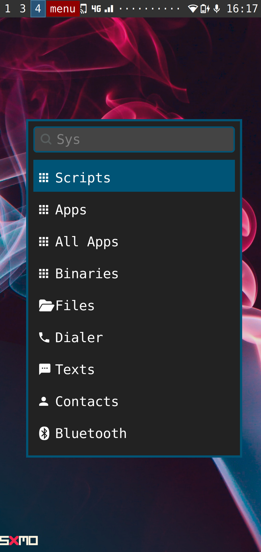
Fun thing about linux phones is that they can all look different without vendor lock in

(Yes i aplogize for the scuffed picture put pressing the screenshot button closes the menu)
I like how there’s a screenshot notification, too! Haha
What phone is this, by the way? And how’s your experience been?
Yeah I tried taking a screenshot first but as you can see the screenshot doesn’t include the panel.
This is a PinePhonePro, the experience is surprisingly usable except for one major thing, the battery life is terrible.
Wether that is specific to the PPP, PostmarketOS or if my phone is defective but after like an hour of use the battery is already drained and even in standby the battery won’t last more then 6 hours or so.
There are some minor things here and there but that is the main reason i can’t use it as a daily driver.
Battery life is terrible
Shit, coming from a S22 Base i wouldn’t even notice.
but after like an hour of use the battery is already drained and even in standby the battery won’t last more then 6 hours or so.
Oh that’s brutal… Damn sucks to hear that. I’d love to have a functioning Linux phone.
+1
I want graphine on my phone so badly but I can’t because it’s carrier locked :(
Holy shit, you can have i3 is this? On Linux phones? So cool. How usable is it, I might try build postmarketOS for my old phone to try it.
Oh I’m jealous. I’m currently knee-deep in debugging hardware so that linux can start on my phone
Damn… Good luck
When I first opened this thread the image didn’t show, so I thought this was a “Linux phones don’t exist” joke.
They fortunately do :)
I wish I was cool enough to run a Linux phone
You probably are! The hardest part might be getting a compatible phone, and sacrificing things that are only available on Android and iOS, specially apps that have no equivalent web version.
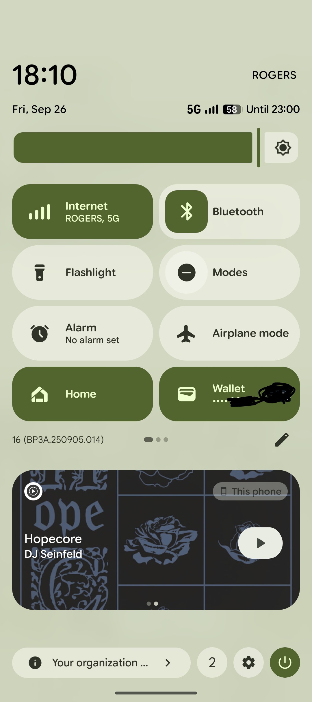
What exactly is the point of the volume slider in the control panel? You have two wonderful buttons for that…
The volume in the menu is more granular than you can get with the buttons.
But you can summon a touch volume control from the buttons.
Well, that’s why, at least on iOS, you can remove it, if you don’t like it.
Sounds complicated and finicky.
Sometimes having a couple different ways to do the same thing is good, most people like options. A big long bar for granular adjustments is pretty nice
I’m an iOS user but stock android is the only one that’s any good in my view. There’s no reason that notifications should pull down over the current view but control center should float on top of it. It’s weirdly inconsistent. Also pretty much everything about notifications on Android is better, which is a shame since it’s pretty core to the user experience.
Man I think Android is the worst of these!
You have to pull that shitty drawer down twice, then swipe through pages. I hate it.
There’s no reason changing your brightness needs to be that terrible.
Android got rid of the wifi toggle. Now its a submenu of the internet tab, which is a toggle for the internet. Google’s developers don’t understand phones because they think disabling internet access is more important than disabling wifi.
unless youre on lineageos or fork, then you still have the WiFi / data buttons 😋
Not bluetooth though. That’s now a menu of your recently paired and currently connected devices.
Not to mention the A12+ increase in spacing and button size. Removing that, you could easily fit 2x the buttons in the same area.
Google has been adding clicks to accomplish any basic task. They’re like the anti-UX.
They also renamed “do not disturb” to “modes”.
The fuck is that supposed to be?! I was panicking the first time I tried to DND my phone after that, hunting for something while needing to not have my phone interrupt… Whatever I was doing, movie or concert starting, doesn’t matter. I hate the new name and still haven’t gotten used to it.
At least in LineageOS you can still replace the Internet button with a dedicated wifi or 5g one.
Back when I was using android, you could swipe down with two fingers to get right to the settings
That works and I would have never in a million years tried it
You still can. At least, on my device running Android 16 I can
Oh my god you can do that???
TIL. Thanks
It was even better when you could differentiate between swiping the left or right half of the status bar down to go to settings or notifications. That might have been a cyanogenmod thing though.
Everything’s
computeriOSI think that’s actually part of the reason they are doing Liquid Glass. Everything looks like iOS in its current state. Supposedly the compute required to calculate the light refractions in iOS 26 will make it more difficult to copy. This is not an endorsement of Liquid Glass. Just what I’ve heard… though personally I don’t dislike it.
didn’t vista do that in the early 2000s?
It did transparency but it didn’t do refractions
The latest version of Android looks even more like an iPhone than what is pictured.
Is this Android 16?
Yup, see under the “🏠 Home” button.
Not a very popular opinion, but I actually love this design. Especially google pixel’s.
Yeah might not be exciting but it is functional. I think we are at a point of diminishing returns in phone UI design that appeals to all audiences.
I would personally argue theres no need to reinvent the wheel just for the sake of being different. As of now we dont really have something that looks better of funtions better (on mobile) so thats what companies embrace.
i miss android 5
Ice Cream Sandwich was the best release IMO
oh god no. 4 was awful. the original material design was such an improvement on that.
Holo was great you take it back
holo looked like it was from 2003.
It works well enough
You forgot nothing OS!


