- cross-posted to:
- linux@lemmy.ml

- cross-posted to:
- linux@lemmy.ml
You must log in or register to comment.
Buried the lead all the way in the comments section
Problem solved ✅
Saw it and couldn’t help laughing.
OTOH being so customizable seems to be a double-edged sword: people can customize almost everything they want but some can find that overwhelming or don’t even want to spend time looking for a setting.
Well that’s embarrassing for them
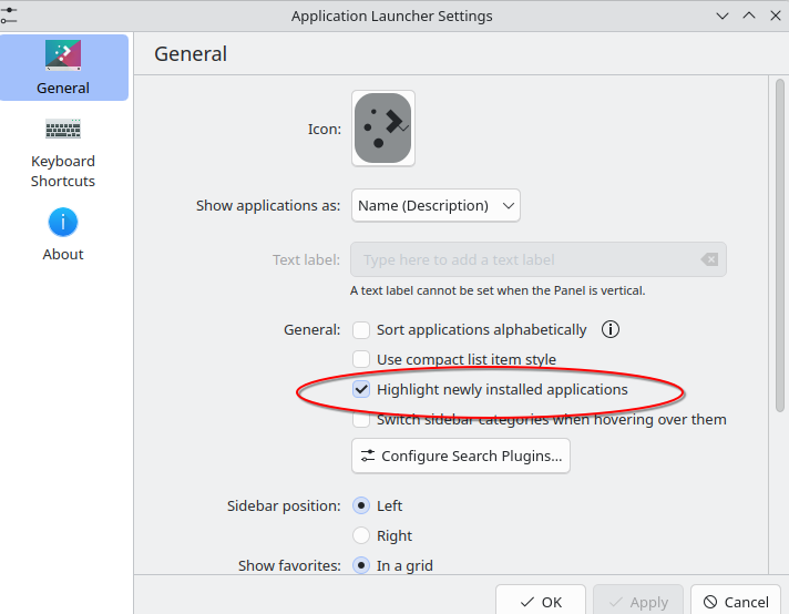
It seems useful to me. When you’ve installed a new application you can immediately see which category it was put in. That said, glad it can be turned off for those who don’t like it.
I like this feature because sometimes apps have weird names and I can’t remember what they’re called a day or two later.
deleted by creator
How does this have anything to do with “impact driven development”?
I think the person is either misunderstanding the purpose of the indicator or has PTSD from seeing that kind of highlights somewhere else. This only highlights what the user has installed recently so that they can find where in the menu was it added. It’s tied to user action, not the developers of the app doing any update or anything like this…
Yeah I agree.
I also don’t like the green dots and new tags - I do see how it is reminiscent of the bloat on Windows start menus even if the motivation is very different. But if I recall they can be turned off so I’d don’t see the issue.
I’m also not a fan of someone donating €100 and then saying “I’ll donate another €100 if you remove this feature”.
open application launcher… upper right corner open settings… turn off the feature 🙄