- cross-posted to:
- technology@lemmy.ml
- cross-posted to:
- technology@lemmy.ml
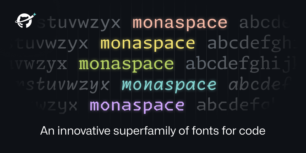
Technically, font healing is a neat idea. It fails for text that does not meat its requirements, i.e. two ‘m’ next to each other. Depending on the characters around them, this might create two different ‘m’.

This is unavoidable, of course. The only solution are proportional fonts. So font healing is a nice idea. It creates a more consistent spacing at the price of less consistent glyphs. Whether one likes this compromise, is a matter of taste. I personally lean towards consistent glyphs, but I did not try it for an extended period.
Ideally, texture healing would distribute the resizing over the whole word, so it would look better and be used in more cases. But that is not possible with OpenType fonts as far as I know.
Commit Mono has smart kerning, which is similar, but it only shifts, not morphs, the shapes. So it avoids that the same letter looks differently in different places. It also works on triplets, not just pairs, so it is more widely applicable. See this comparison.
Why the fuck is a page about fonts using 50% CPU?! Is it mining crypto or something?
Average website experience in 2023


