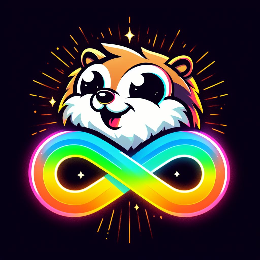
Oddly hard to read font. No thoughts on the message of the meme, too complicated or I’m missing the point.
That may well be the worst font I’ve ever seen. Holy hell.
Someone created this hard-to-read font, someone used it to make this and someone shared it. I don’t see the appeal at all.
It’s too painful to read.
Autism isn’t an art, so this lost me 4 very difficult to read words in.
So, I have some complicated feelings about this message. I’m not gonna touch on the font, as that’s already been done, but rather just the message. Autism does not imply nonconformity and nonconformity does not imply autism. I know neurotypicals that are nonconformists, and I know autistic folks who mask so deeply that they conform just like any average neurotypical. Autism is much more than simply the act of conformity/nonconformity. And I think the biggest problem I have here is that for autistic folks, nonconformity is (most often) not a choice. It’s simply the way we function, and often times masking doesn’t feel like a choice, either. It’s more of a necessity to survival.
I struggle to praise the idea that autism is a performance art as is being loosely implied in this statement. I consider it a way of life rather than a conscious, artistic choice. Especially for those with severe presentations that are disabling, I feel like this statement is exceptionally exclusionary.
I just really wish autism wasn’t five different disorders under a trenchcoat. I find this message a little syrupy (and, as the other commenter mentioned, bizarrely difficult to read), but not wholly inaccurate for my experience. It feels pretty thoughtless when applied to people who are significantly impaired by their autism, though.
But yeah, I have been called weird all my life, but never for what I expect (apparently doing things thoroughly is weirder than crippling social anxiety, because people always pick on the former and identify with the latter). I don’t dislike being weird, it’s just a surprise to me what strikes people as such.
No Sir, I don’t like it.
Too unreadable, didn’t read
On an unjoking note: it says “autism is the art of being different in a world that seeks conformity”.
It’s…not an art. That would imply that we have a choice in the matter, when the only choice (arguably not a true choice in many contexts) is to suppress our inherent differences by masking or leave them on display.
Autism is a shorthand for our brains being different from the norm in specific ways, with variability in the severity and coping mechanisms from individual to individual that means these differences range from “disorder” to “disability”.
Yeah I don’t want to be like this thanks
I think that one of the biggest struggles we see is infantilization. This whole image screams it. The bright colors. The silly font. Even the message that try’s to paint autism as something special and unique. This doesn’t give off “I’m proud of who I am”. To me it gives off “mom who’s trying to make her child feel better about being excluded.”
No.
Bad meme. And I’m gonna be blunt, because you know why.
I get what you’re shooting for but format, phrasing and composition is all cringe here.
Keep trying though. Design is hard.
This is awful. For so many reasons.


